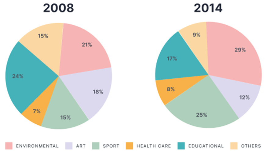
The charts show the percentage of volunteers by organizations in 2008-2014.
Summarise the information by selecting and reporting the main features, and make comparisons where relevant. Write at least 150 words.
 Giải bởi Vietjack
Sample 1:
The pie charts illustrate the proportion of participants who work without getting paid in different sectors from 2008 to 2014.
Overall, it can be seen that while the percentage of volunteers in education, art and other fields decreased, that in environment, sport and healthcare saw an upward trend during the same period. Another highlight is that, although in 2008, the educational sector was the most attractive organization for volunteers, in the next 7 years, this dominance was challenged by environment.
In 2008, while education and environment were the two sectors that attracted the most volunteers (24% and 21%), the proportion of participants doing voluntary work in healthcare accounted for only 7%. The figure was only half of the percentage of volunteers in the remaining area, namely sport and others which shared the same pattern of 15%.
In the next 7 years, 17% of volunteers in education made its leading position beaten by environment with 29% of contributors. At the same time, there were 25% of volunteers in sport, which was roughly double the figure in art and triple that in healthcare.
Sample 2:
The pie charts depict the percentage of participants who worked unpaid in multiple sectors from 2008 to 2014.
Overall, there was a decline in the proportion of volunteers in education, art, and other sectors, while there was a surge in that in the environment, sports, and healthcare sectors throughout the same time frame. Furthermore, it is noteworthy that while the educational sector held the highest appeal for volunteers in 2008, its dominance was subsequently challenged by the environment over the following 7 years.
In 2008, the sectors of education and environment were the most popular among volunteers, with 24% and 21% of participants respectively. However, only 7% of volunteers were involved in healthcare. The statistics represented just 50% of the total number of volunteers in the remaining region, specifically in the fields of sports and other activities, which also had a similar distribution of 15%.
In the next seven years, the percentage of volunteers in the education sector who held the leadership position was surpassed by the environment sector, which had a higher percentage of contributors at 29%. Simultaneously, the percentage of volunteers in sport was 25%, approximately twice the proportion in art and three times that in healthcare.
Sample 3:
The bar charts depict the constitution of volunteers, categorized in various social sectors, in an unspecified country between 2008 and 2014.
As can be seen from the graphs, most volunteers opted for educational organizations in 2008, whilst 2014 witnessed a rise in the rate of environmental volunteers. Healthcare was the least favoured sector among volunteers in the two surveyed years.
In 2008, 24% of volunteers worked for educational organizations, compared to 21% and 18% of those who volunteered in the environmental and arts categories respectively. Next came the share of volunteers who chose to work for sports and other organizations with 15% in each sector. Bottom of the list was healthcare with only 7% of people volunteering.
In 2014, ranked in first place was no longer the educational sector as environment took the place with 29% of volunteers registered, a dramatic 8% increase. This was followed by sports with 25% of total volunteers, whereas the figure for educational volunteers saw a corresponding decline to 17%. Arts and other organizations also recorded a drop in the rate of volunteers, accounting for 12% and 9% of total people volunteering. The percentage of healthcare volunteers remained relatively the same with only 8%.
Sample 4:
The given pie charts compare the proportion of people who did voluntary work in different organizations in 2008 and 2014.
Overall, while the percentage of people volunteering for the environment, healthcare services and sports activities followed an upward trend, the reverse pattern was seen in the figure for the remaining groups. Besides, healthcare organizations were staffed with the least volunteers in both years.
In the year 2008, volunteers working in educational organizations accounted for the largest proportion, at 24%, in comparison with 21% and 18% of people volunteering in environmental and art projects respectively. Meanwhile, 15% of volunteers worked in sports organizations, which was the same as the figure for others. Voluntary work related to healthcare, however, was the least common choice among people, with a mere 7% participants.
After 6 years, the percentage of volunteers in educational organizations decreased to 17%. Likewise, the figure for people working in art and other volunteering activities witnessed a fall of 6%. In contrast, there were many more volunteers working in environmental and sports organizations compared to other groups, with 29% and 25% respectively. Activities in the healthcare sector, despite a slight rise of 1% in its figure, remained the least preferred option among volunteers.
Sample 5:
The pie charts compare the percentage of volunteers who worked for different types of organizations in 2008 and 2014. The categories include environmental, sport, education, healthcare, art, and others.
Overall, there was a notable increase in the percentage of volunteers working for environmental and healthcare organizations, while the proportion of volunteers in educational and art organizations saw a decline. The share of volunteers in other categories remained relatively stable over the six-year period.
In 2008, educational organizations had the highest share of volunteers, accounting for 24%, followed by healthcare and environmental organizations with 21% and 18%, respectively. Art and sport organizations made up a smaller portion, at 15% each, while the “other” category had the lowest percentage at 7%.
By 2014, environmental organizations had become the most popular choice for volunteers, with their share increasing significantly to 29%. Healthcare organizations also saw a rise to 25%, while the proportion of volunteers in educational organizations dropped to 17%. The percentage of volunteers in sport organizations remained stable at 15%, but art organizations experienced a noticeable decrease, falling to just 12%. The “other” category saw a slight increase, rising to 9%.
Sample 6:
The provided pie charts illustrate the percentage of people doing voluntary work in various organizations in 2008 and 2014.
It is noticeable that the figures for volunteers in Educational, sport and health care organizations decreased while those in Environmental, art, and other ones declined over the 6-year-period. Also, Heath care remained the least attractive area to volunteers.
In 2008, almost a quarter of total volunteers worked for Environmental organizations, followed by Education, at 21%. The percentage for Environmental dropped by 7% to 17% in 2014 whereas Education witnessed a dramatic jump to 29%. Sport sector, which attracted 15% of voluntary personnel, experienced a remarkable increase to 25%., making it the second most favorite sector after Education in 2014.
The voluntary participation in art organizations went down from 18% in 2008 to 12% in 2014. Similarly, the figure for volunteers working in other organizations stood at 15% in 2008 and then fell to 9% in the following 6 years. The percentage for health care remained lowest in both 2008 and 2014, at 7% and 8%, respectively.
Sample 7:
The pie charts show the proportions of people volunteering in various kinds of organisations in 2008 and 2014.
It is clear that while volunteers’ participation in environmental, sport, and health care organisations increased, the opposite was true for other types of organisations. Additionally, the percentages of health care volunteers were by far the lowest during the two years.
In 2008, volunteering in educational organisations was the most common choice, accounting for nearly a quarter of all volunteers, while 21% and 18% of volunteers took part in environmental and art projects respectively. 15% of volunteers worked in sport organisations, and another 15% in other organisations, while only 6% volunteered in health care.
In 2014, significantly more volunteers worked in environmental and sport organizations compared with the other fields, at 29% and 25% respectively. Meanwhile, the figures for art and other volunteers both fell by 6%. There was also a slight fall in volunteers in educational organizations, at 17%, while volunteering in health care was still the least preferred option, at only 8%.
Sample 8:
The table gives information about the participation in 6 categories of activities such as (environment, Arts, Sports, Health care, Educational, and others). The organization is estimated in percentage in the years 2008 and 2014.
Overall, at the beginning of the period, participants were the least, especially in sports and health. At the same time, education was the most significant in the band. In comparison, at the end of the year environment became the largest segment. However, the arts and others had slight changes in both years.
The number of volunteers in sports and health are lower in 2008. The groups are around 15% and 7%. They experience more than a fifth in 2014. In contrast, education is threefold higher at starting but dramatically fell to about 17% in the last year.
In 2008, the environment club was approximately 21%. That exceeded up to a one-half quarter in the last period. Whereas the Arts and others are slightly (18% and 15% respectively) and both are less than one-tenth and end up in 2014.
2000 câu trắc nghiệm tổng hợp Tiếng Anh 2025 có đáp án (Phần 18)
The map below shows a school in 1985 and the school now.
Summarise the information by selecting and reporting the main features, and make comparisons where relevant. Write at least 150 words.
The chart below shows the percentage of the population in the UK who consumed the recommended daily amount of fruit and vegetables in 2002, 2006 and 2010.
Summarise the information by selecting and reporting the main features, and make comparisons where relevant. Write at least 150 words.
The table and the chart below provide a breakdown of the total expenditure and the average amount of money spent by students per week while studying abroad in 4 countries.
Summarise the information by selecting and reporting the main features, and make comparisons where relevant. Write at least 150 words.
The two charts below show the proportion of qualified graduates in a particular country.
Summarise the information by selecting and reporting the main features, and make comparisons where relevant. Write at least 150 words.
The maps indicate how Huntingdon has changed throughout time, both in terms of present changes and anticipated future changes.
Summarise the information by selecting and reporting the main features, and make comparisons where relevant. Write at least 150 words.
The line graph shows the number of people who used different communication services in the world.
Summarise the information by selecting and reporting the main features, and make comparisons where relevant. Write at least 150 words.
The diagram below shows how a modern landfill for household waste is designed.
Summarise the information by selecting and reporting the main features, and make comparisons where relevant. Write at least 150 words.
The bar chart below shows the proportion of the population aged 65 and over of three countries in 1980 and 2000 and prediction in 2030.
Summarise the information by selecting and reporting the main features, and make comparisons where relevant. Write at least 150 words.
The chart below shows the amount of energy generated from wind in four countries from 1985 to 2000.
Summarise the information by selecting and reporting the main features, and make comparisons where relevant. Write at least 150 words.
The table details the international tourist arrivals (in millions) in 8 countries in 2009 and 2010 and the changes (in percentages).
Summarise the information by selecting and reporting the main features, and make comparisons where relevant. Write at least 150 words.
The table below shows the percentage of working men and women in different areas of employment in one country in 1986, 1996 and 2006.
Summarise the information by selecting and reporting the main features, and make comparisons where relevant. Write at least 150 words.
The charts below show the water levels of 6 cities in Australia in October 2009 and 2010.
Summarise the information by selecting and reporting the main features, and make comparisons where relevant. Write at least 150 words.
CÔNG TY TNHH ĐẦU TƯ VÀ DỊCH VỤ GIÁO DỤC VIETJACK
- Người đại diện: Nguyễn Thanh Tuyền
- Số giấy chứng nhận đăng ký kinh doanh: 0108307822, ngày cấp: 04/06/2018, nơi cấp: Sở Kế hoạch và Đầu tư thành phố Hà Nội.
2021 © All Rights Reserved.