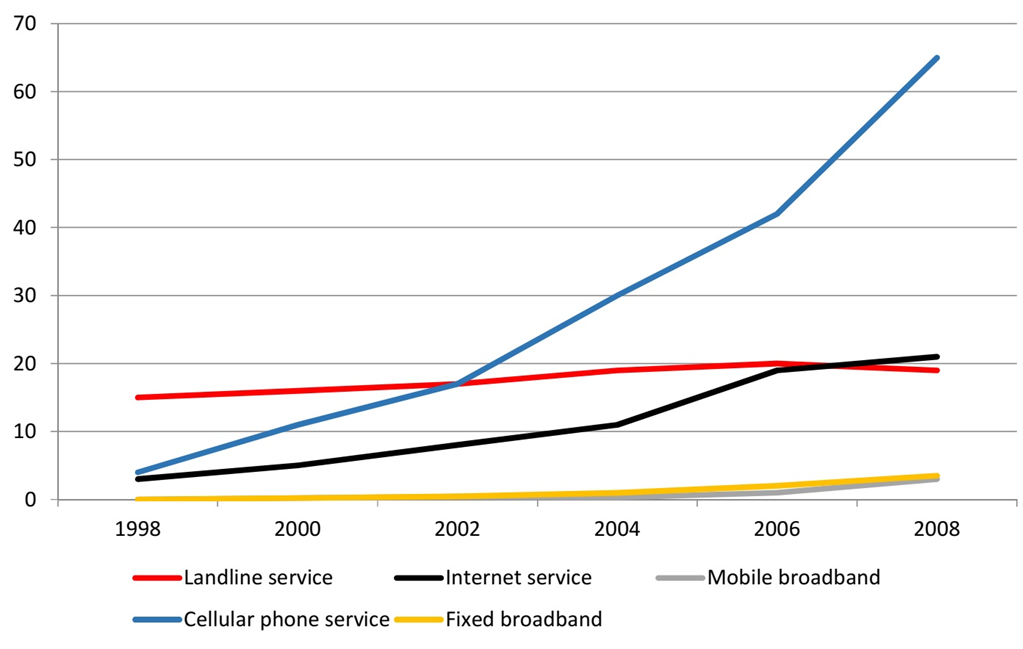
The line graph shows the number of people who used different communication services in the world.
Summarise the information by selecting and reporting the main features, and make comparisons where relevant. Write at least 150 words.
 Giải bởi Vietjack
Sample 1:
The line graph gives data about the number of users of five different communication services worldwide from 1998 to 2008.
Overall, all services experienced some growth over the 10-year period, with cell phone and Internet services experiencing the most growth and becoming the most popular forms of communication.
In 1998, the figures for cell phone and Internet users started at around 5% of the population. They both increased over the remaining years, with cell phone service gaining the highest position in 2008, with more than 60% percent of the population using this type of service. This number was approximately three times as much as that of Internet service in the same year.
Meanwhile, throughout the 10-year period, little change was seen in the use of landline services, at about 15% of the population. Also, the use of mobile and fixed broadband services was minimal before 2002. The figures for these two services rose slightly to roughly 5% of the population by the last year.
Sample 2:
The line graph gives data about the number of users of 5 different communication services worldwide from 1998 to 2008.
Overall, cell phone and Internet services became more and more popular, and others similarly experienced minimal growth over the years.
In 1998, the figures for cell phone and Internet users started at around 5 per 100 inhabitants. They both increased over the remaining years, with cell phone service gaining the higher position in 2008, at more than 60 users per 100 in habitants. This number was approximately three times as much as that of Internet service in the same year.
Meanwhile, throughout this 10-year period, little change was seen in the use of the landline service, with about 15 users per 100 inhabitants. Also, mobile and fixed broadband had yet to be introduced by 2002. The figures for these two services rose slightly to roughly 5 users per 100 inhabitants in the last year.
Sample 3:
The line graph illustrates the number of people in the world who used five categories of communication services at two-year intervals from 1998 to 2008.
Overall, although all kinds of communication services tended to grow during the entire time period, only the increase in popularity in cellular phone service was significantly higher than the rise in that of other means of communication.
In 1998, the figure for cellular phone service was round about 500 people, as same as Internet service’s. From 1998, the number of individuals using cellular phone services increased dramatically to exactly 6000 people and became the most common means of communication in the year 2008. Additionally, the figure for Internet service was about five times higher than during the period of 10 years.
With 1500 people used, the figure for landline service was the highest number in 1998. However, that figure had a minor increase to 2000 people in 2006 before it dropped slightly to approximately 1800 people in 2008. The figure for mobile broadband and fixed broadband remained nearly 0 throughout the first six-year period. They were also the least popular kinds of communication services despite rising up to 500 people in 2008.
2000 câu trắc nghiệm tổng hợp Tiếng Anh 2025 có đáp án (Phần 18)
The map below shows a school in 1985 and the school now.
Summarise the information by selecting and reporting the main features, and make comparisons where relevant. Write at least 150 words.
The chart below shows the percentage of the population in the UK who consumed the recommended daily amount of fruit and vegetables in 2002, 2006 and 2010.
Summarise the information by selecting and reporting the main features, and make comparisons where relevant. Write at least 150 words.
The two charts below show the proportion of qualified graduates in a particular country.
Summarise the information by selecting and reporting the main features, and make comparisons where relevant. Write at least 150 words.
The maps indicate how Huntingdon has changed throughout time, both in terms of present changes and anticipated future changes.
Summarise the information by selecting and reporting the main features, and make comparisons where relevant. Write at least 150 words.
The table and the chart below provide a breakdown of the total expenditure and the average amount of money spent by students per week while studying abroad in 4 countries.
Summarise the information by selecting and reporting the main features, and make comparisons where relevant. Write at least 150 words.
The charts show the percentage of volunteers by organizations in 2008-2014.
Summarise the information by selecting and reporting the main features, and make comparisons where relevant. Write at least 150 words.
The diagram below shows how a modern landfill for household waste is designed.
Summarise the information by selecting and reporting the main features, and make comparisons where relevant. Write at least 150 words.
The bar chart below shows the proportion of the population aged 65 and over of three countries in 1980 and 2000 and prediction in 2030.
Summarise the information by selecting and reporting the main features, and make comparisons where relevant. Write at least 150 words.
The chart below shows the amount of energy generated from wind in four countries from 1985 to 2000.
Summarise the information by selecting and reporting the main features, and make comparisons where relevant. Write at least 150 words.
The table details the international tourist arrivals (in millions) in 8 countries in 2009 and 2010 and the changes (in percentages).
Summarise the information by selecting and reporting the main features, and make comparisons where relevant. Write at least 150 words.
The table below shows the percentage of working men and women in different areas of employment in one country in 1986, 1996 and 2006.
Summarise the information by selecting and reporting the main features, and make comparisons where relevant. Write at least 150 words.
The charts below show the water levels of 6 cities in Australia in October 2009 and 2010.
Summarise the information by selecting and reporting the main features, and make comparisons where relevant. Write at least 150 words.
CÔNG TY TNHH ĐẦU TƯ VÀ DỊCH VỤ GIÁO DỤC VIETJACK
- Người đại diện: Nguyễn Thanh Tuyền
- Số giấy chứng nhận đăng ký kinh doanh: 0108307822, ngày cấp: 04/06/2018, nơi cấp: Sở Kế hoạch và Đầu tư thành phố Hà Nội.
2021 © All Rights Reserved.